Client: Le Queer Magazine
Graphic Design | Typography | Publication Design
Graphic Design | Typography | Publication Design
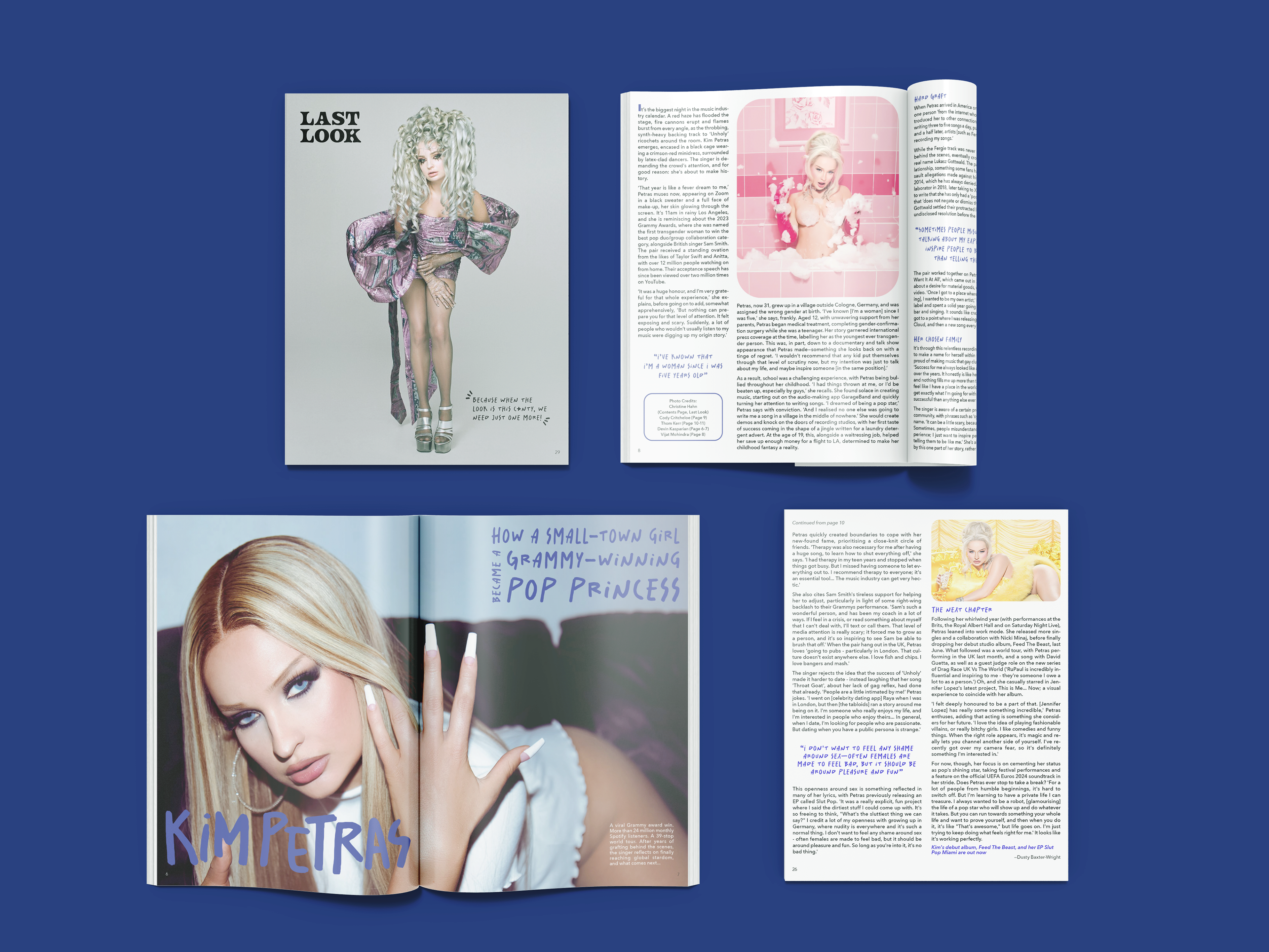
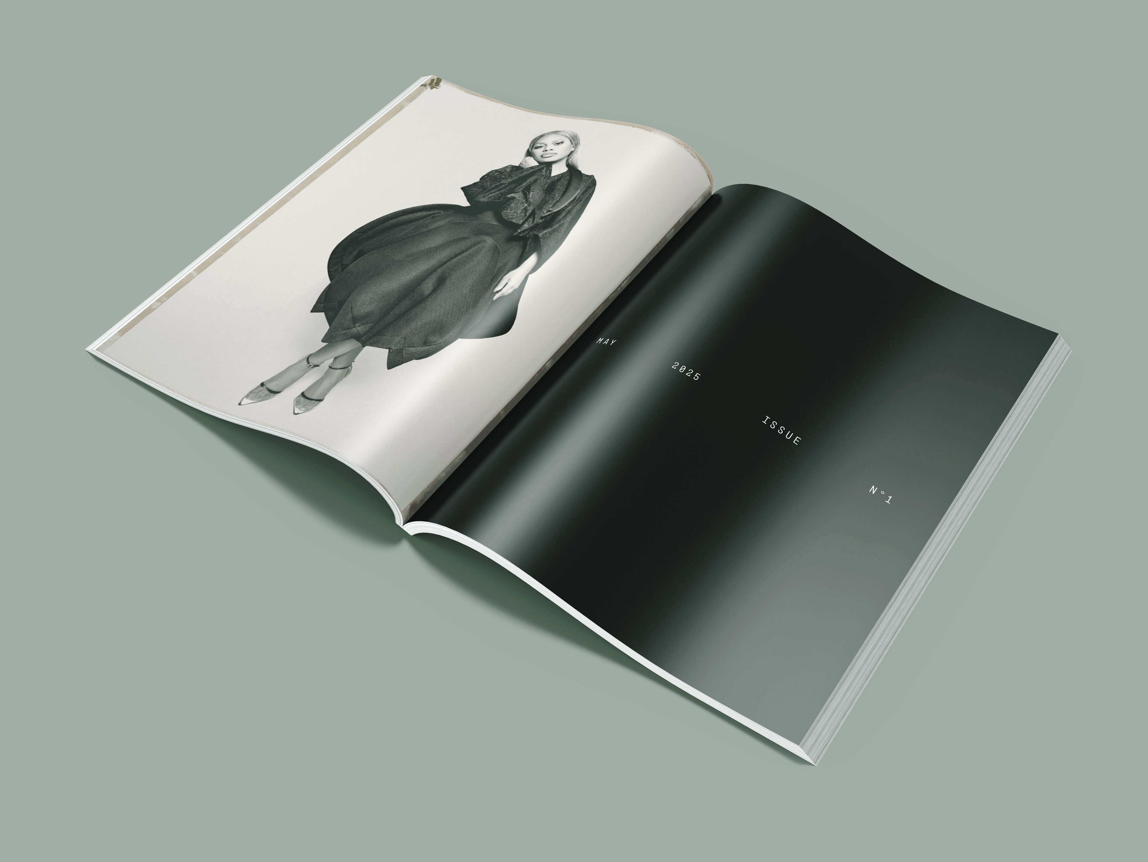
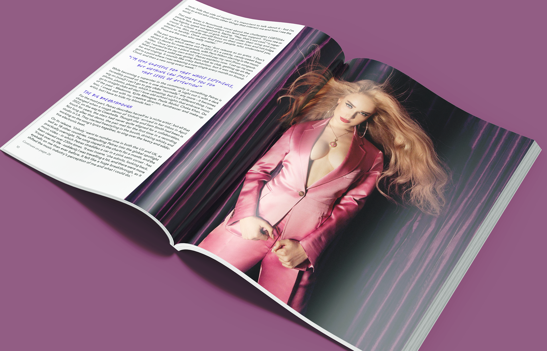
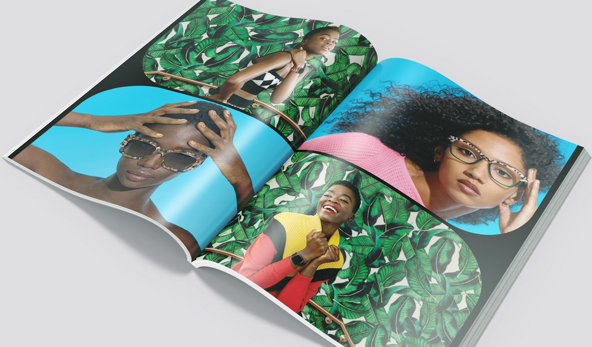
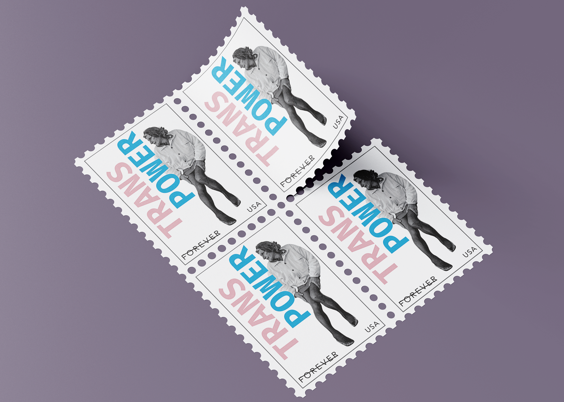
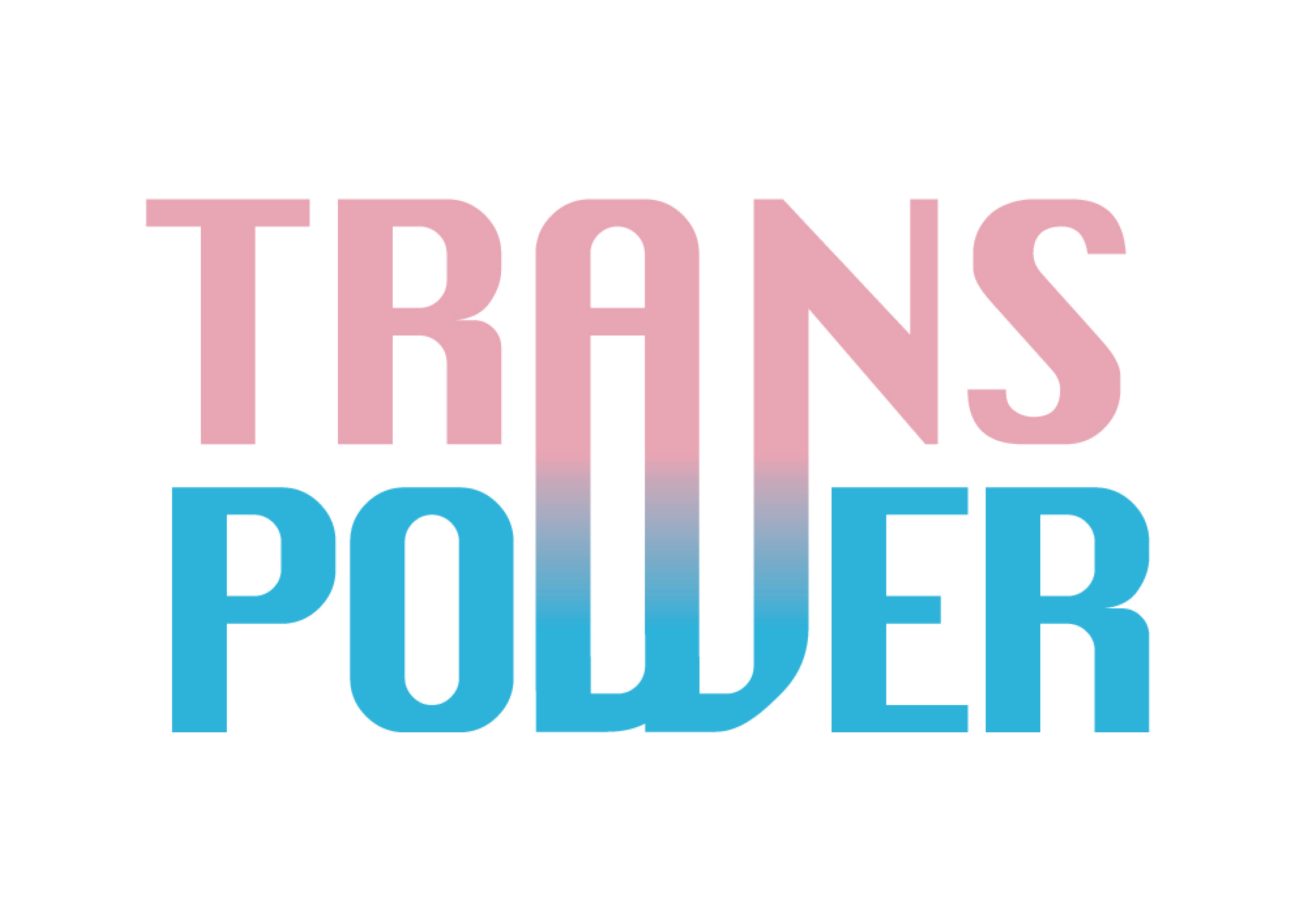
Le Queer Magazine is a bold, unapologetic celebration of LGBTQIA+ excellence across professional industries. Le Queer was designed not just as a magazine, but as a movement. A love letter to authenticity, the goal was to create a publication that didn't whisper, didn't blend in, and didn't apologize. This magazine amplifies queer voices and celebrates difference through a cohesive and punchy visual identity that resonates emotionally with both queer readers and allies.
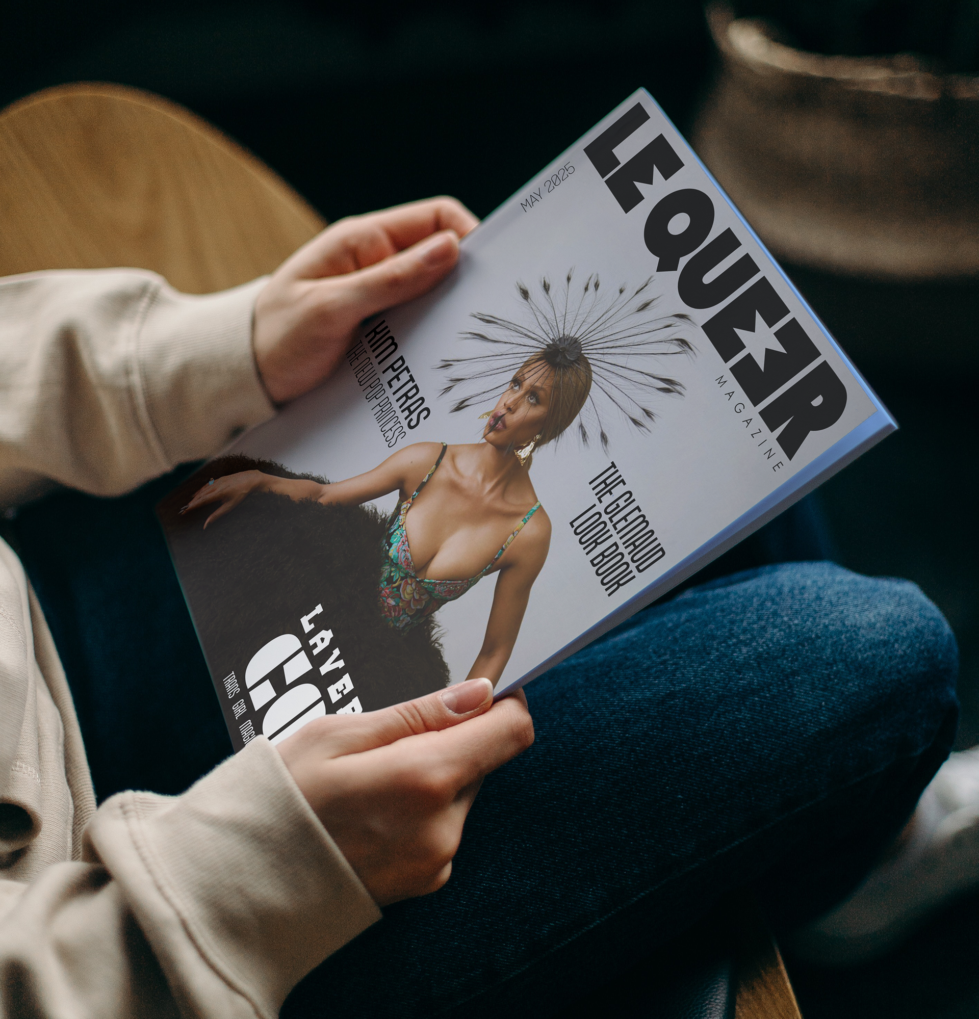
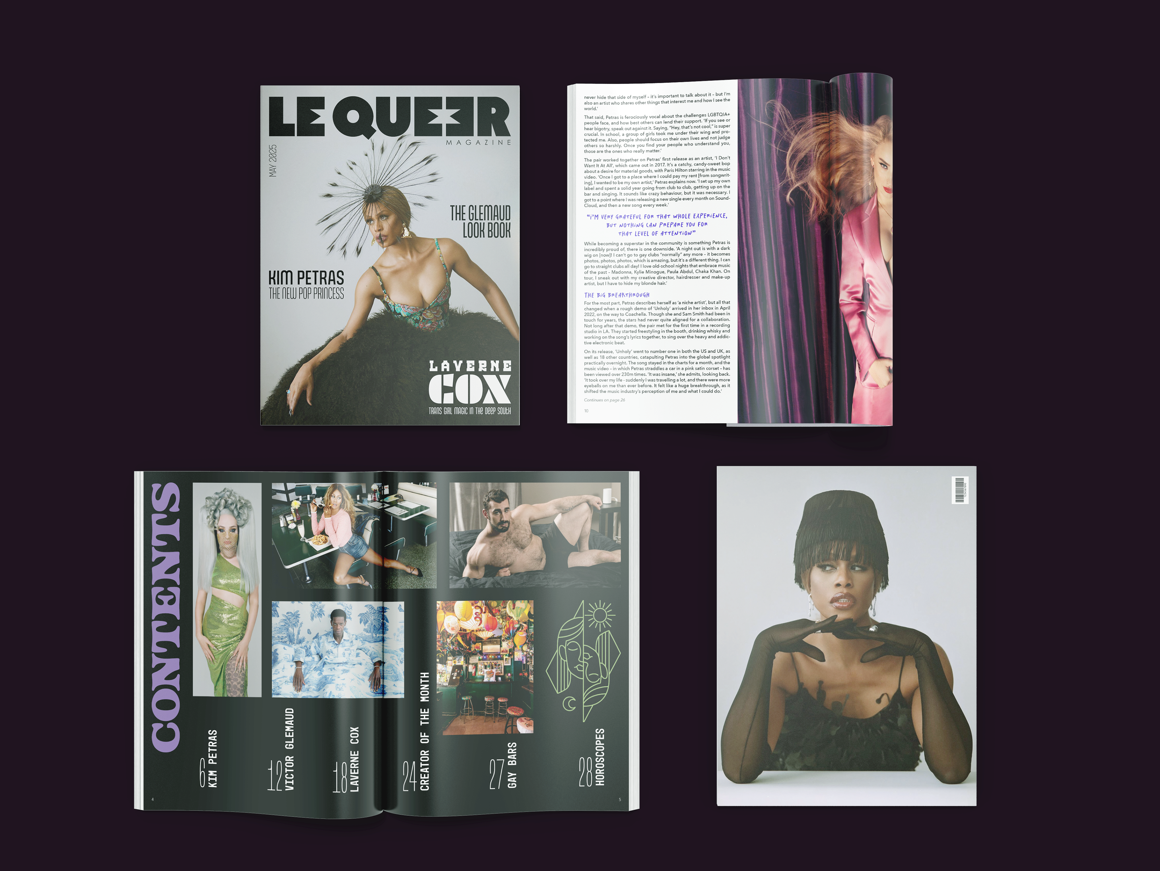

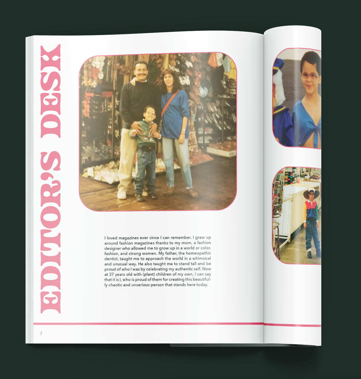
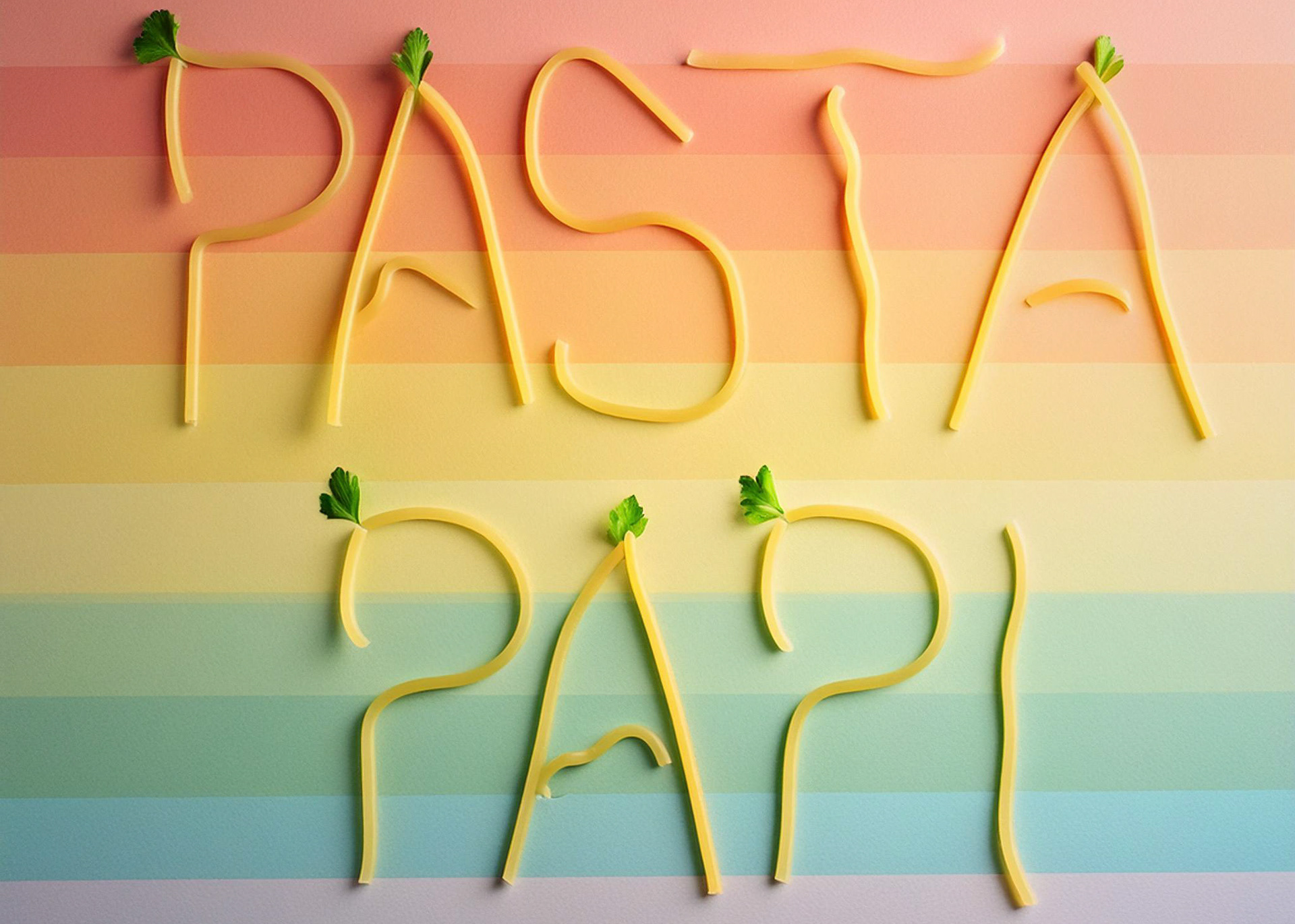
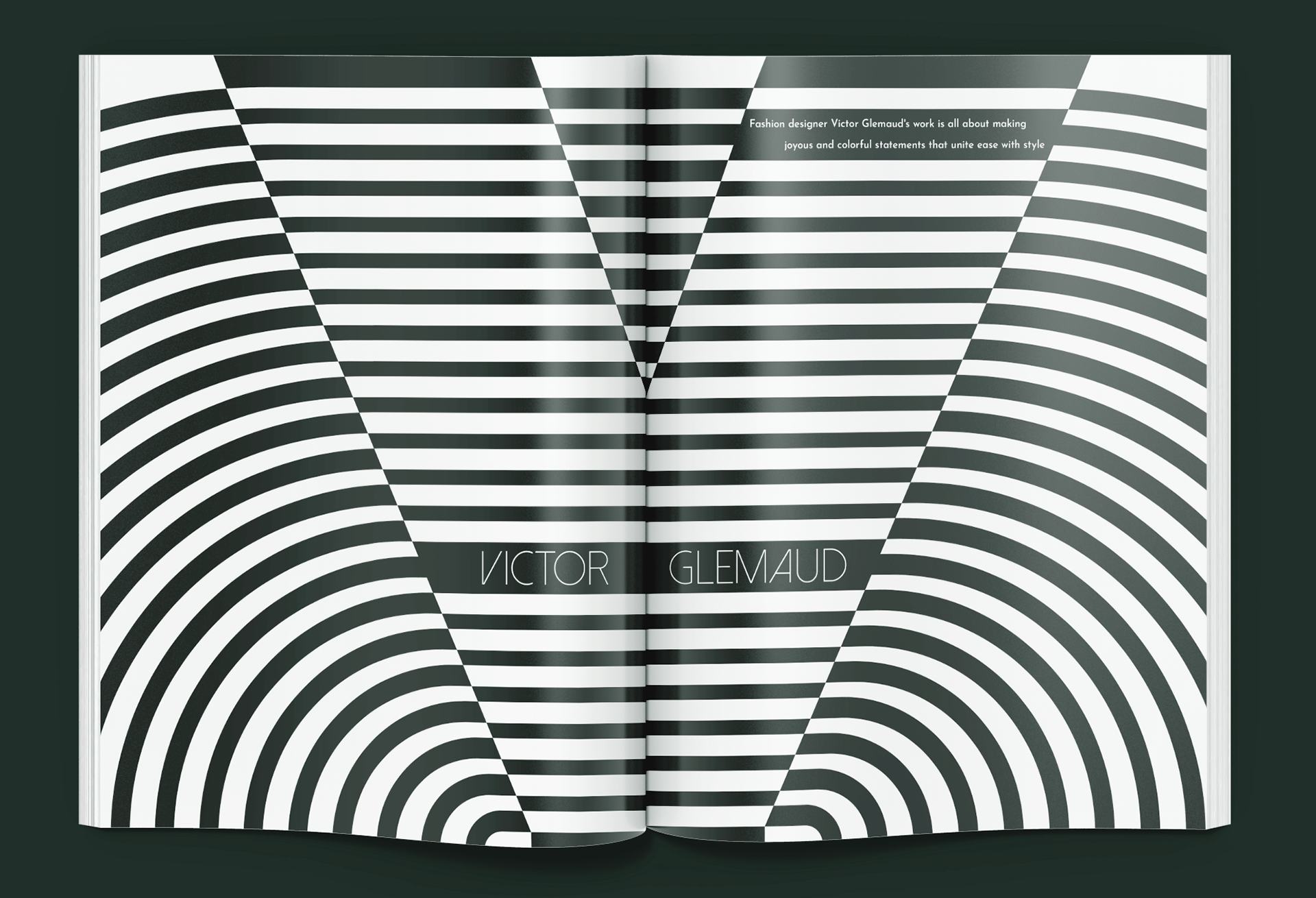
The central visual direction emerged from my upbringing: a world of fashion, color, whimsy, science, and proud defiance. The magazine's design reflects this duality; queer and fierce, professional yet playful, structured with subversive flare. Each spread was designed as a mini stage, giving each subject their own space to shine. Grids were deliberately broken in some sections to reflect the rebellious, inclusive, and proud nature of the LGBTQIA+ Community.